Graph Visualization
17 min read
What is Graph Visualization?
Graph visualisation is just what it sounds like - a visual representation of your data as a graph. A graph is a structure of objects that are connected. Thus graph visualisation is the visualisation of entities (nodes), and relationships among them. Going back to SQL and to the world of bar and pie charts, we all know the benefits of visualising data. Visualised data is more digestible, understandable, and gets the point across faster. Graph visualisation has these and many more benefits. But before we dive into the benefits, and the importance of graph visualisation, let’s take a step back and talk about graphs and graph databases.
What are graphs and graph databases?
In mathematics (graph theory), a graph is a structure of connected objects. The structure is composed of nodes (entities) and relationships (connections between the entities). Even the picture below is a graph - it shows two entities connected by a relationship. For more details, read my blog about graphs, graph theory, and knowledge graphs.

Graph databases store your data in this structure (instead of e.g., in rows and columns). Doing so has several advantages (when dealing with connected data) including:
- It is intuitive. Of course, it makes sense to store some data in rows and tables. The data that would make sense to store in this way is not connected. An example would be people and their addresses. Every address would be connected only to the people living there, but not to other addresses. However, the majority of the data nowadays is complex and connected. Graphs accommodate this complexity with tremendous ease. Their simple and flexible schema can store complex, interconnected information and accurately represent the real world.
- It takes up less space. Again, the more connected your data is, the less sense it makes to store it in an SQL database. Doing so would take up more space and would make the data difficult to read - which brings us to the next point.
- Fast and easy access patterns. Every node in a graph can be a starting point for your graph traversal. This translates to shorter time to insight, higher performance, and the ability to provide results in real-time.
- Flexible structures. Even though graphs have a structure, it is highly flexible. It’s only nodes and edges - only entities connected by relationships. Anything in the world can be represented in such a structure. The graph structure mirrors the real world. Everything in the world is naturally connected and complex. Social networks, life stories, and nature are only some of the examples proving the point.
Graph Visualisation
Now you understand the power of graph databases and when to use them, we can get back to graph visualisation. Storing data in a graph and not having it visualised can be enough for some use cases. However, visualising your data almost always helps. Visualisation comes in handy when you need to understand your data quickly. It makes it easy to explain and communicate your insights to others, and it is a means for further analysis.
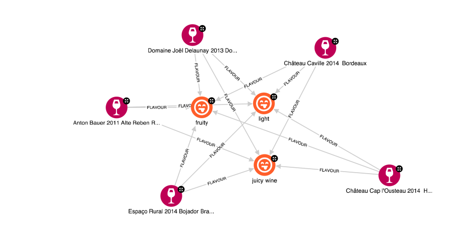
Some (basic) analysis can be performed visually. You can identify patterns, understand connections, and spot outliers directly from the visualisation. Below is an example from our wine graph. You can see that the different wines have the same flavours. This is a very simple example however, it is clear that the data visualised this way is connected, and the connections are easy to understand.
More sophisticated analysis can be performed with queries, and graph data science algorithms. There are many types of algorithms you might find useful to run on your data. And the results of these algorithms are much more digestible when visualised.
For example, we can:
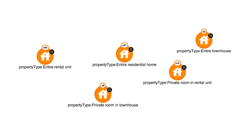
- Visualise identified clusters, their size, contents, and relationships to other clusters. In the picture below, I have grouped housing properties by their type. You can see that in my database there are only 3 listings offering to rent entire townhouses, and many more listings with other property types such as “entire rental units.”
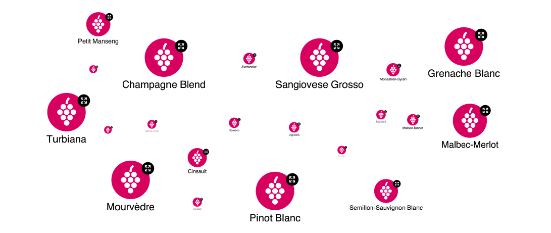
- Visualise the most important (central) entities in your network, sparking further risk analysis. Again, you can see this in the picture below. The size of the nodes is based on their centrality to the entire database. The more wines are connected to a specific grape, the bigger - more central - the node is. Thus, you can easily see that there are few Champagne Blend, Turbiana, or Grenache Blanc wines in my database, while much fewer of some other varieties.
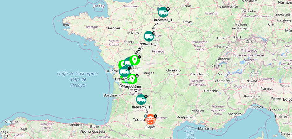
- You can also find shortest paths e.g. for logistics operations and visualise them on a map.
Finally, interacting with your visualisation allows you to understand the data more easily, explore it, and decide on the next steps for your analysis.
Graph databases are an excellent fit for interconnected data. The benefits of using graph databases can be heightened by visualising the data. Graph visualisations can help you:
- Communicate, explain, and back the results of your analysis.
- Perform graph analysis. Visualising your data allows you to quickly recognize patterns, gaps, and outliers in your data. Algorithmic analysis and its results can also be visualised, making the results easier to understand.
- Interact with the data and gain a deeper understanding of it.
What are the advantages of graph visualization?
Graph visualization has many advantages, such as:
- Facilitating Comprehension of Complex Data: Graph visualization helps users understand complex datasets by representing data in a visual format that highlights relationships, structures, and connections among entities. This visual approach can make it easier to grasp intricate patterns and trends that might be challenging to interpret through text or numbers alone.
- Enhancing Data Exploration and Interaction: Interactive graph visualizations allow users to explore data in a flexible manner, enabling them to zoom, pan, and drill down into specific nodes or connections. This interactivity can foster deeper engagement with the data and support hypothesis-driven exploration.
- Identifying Relationships and Dependencies: Graph visualization is particularly effective at illustrating relationships, such as dependencies, hierarchies, and associations. This advantage is critical in fields like social network analysis, supply chain management, and fraud detection, where understanding connections is key.
- Supporting Decision-Making and Communication: Graph visualization can help stakeholders visualize complex information and support decision-making by providing a clear and intuitive representation of data. This visual approach can facilitate communication among teams, enabling them to quickly understand data-driven insights and make informed decisions.
- Accelerating Data Analysis and Pattern Recognition: Visualizing data as a graph can speed up analysis and aid in the recognition of patterns, clusters, and anomalies. By allowing users to visually detect trends and irregularities, graph visualization can accelerate the process of identifying key insights and reducing analysis time.
- Enabling Data-Driven Storytelling: Graph visualization can be a powerful tool for storytelling, allowing users to construct narratives around data. This capability can be particularly useful for presentations, reports, and educational purposes, where conveying complex information in a compelling way is essential.
- Promoting Collaboration and Knowledge Sharing: Graph visualization encourages collaboration among team members by providing a shared visual representation of data. This common ground can enhance knowledge sharing and foster a collaborative approach to solving complex problems.
How to create effective Graph Visualization? Virtual Relations
Unlike in other storages, graph databases are making indirect relationships evident and often more important than direct relationships.
From a visualisation perspective, implicit relationships might not be so easy to discover as the amount of direct relationships will often be the first obstacle analysts will encounter when performing their job.
To illustrate this obstacle, we will use a graph having the following schema:
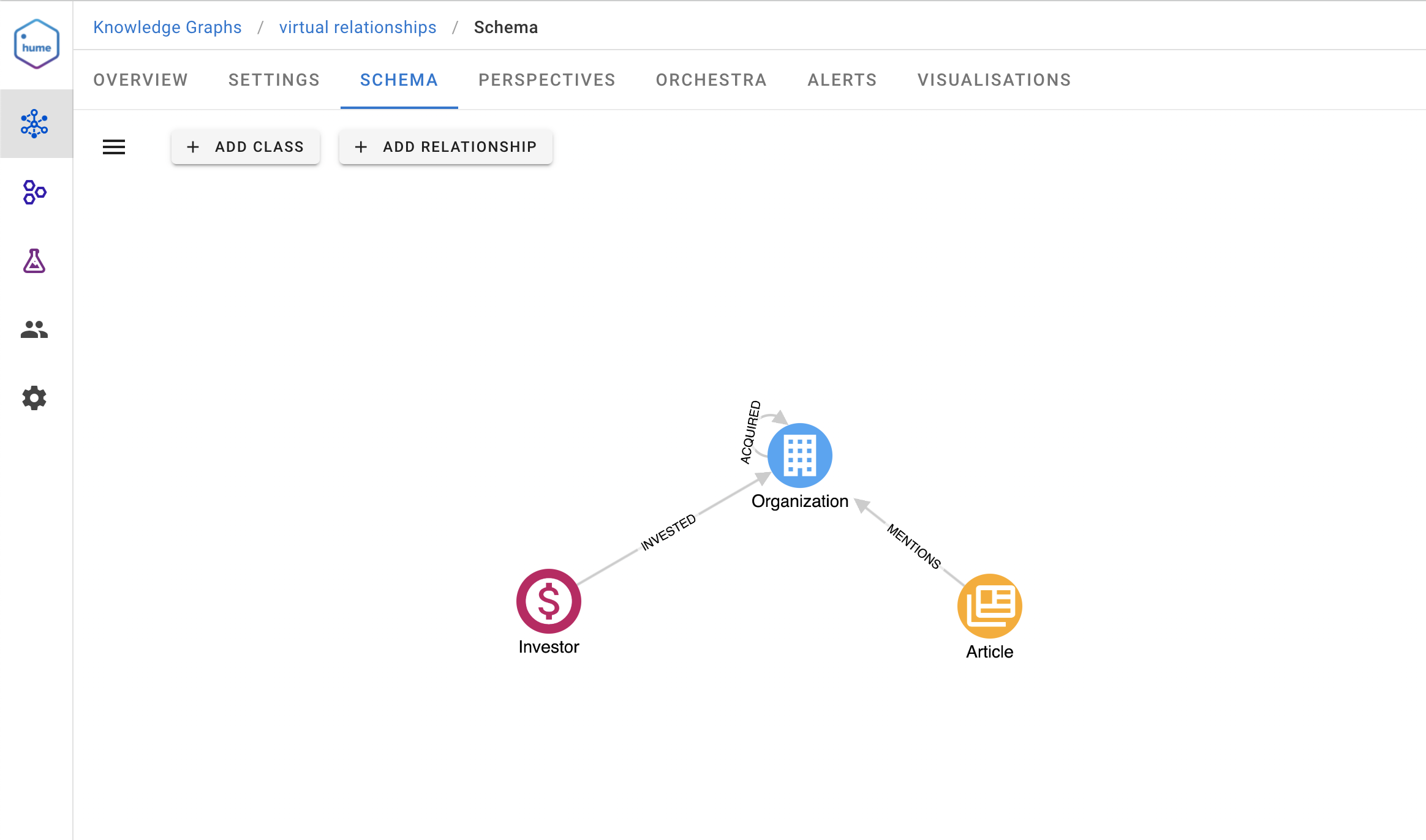
An analyst will be interested in figuring out which articles mention organisations of his portfolio of investments.
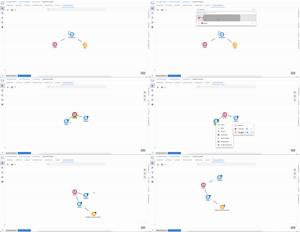
Based on the schema, the analyst will likely go into a sequence of steps being:
- Search for an investor
- Expand the INVESTED relationships
- From the returned Organization nodes, optionally expand the ACQUIRED relationships
- Select all Organization nodes
- Expand the MENTIONS relationships
It isn’t a tedious process if your portfolio contains only two Organizations
But if you are Sequoia capital, your visualisation experience will likely be less pleasant.
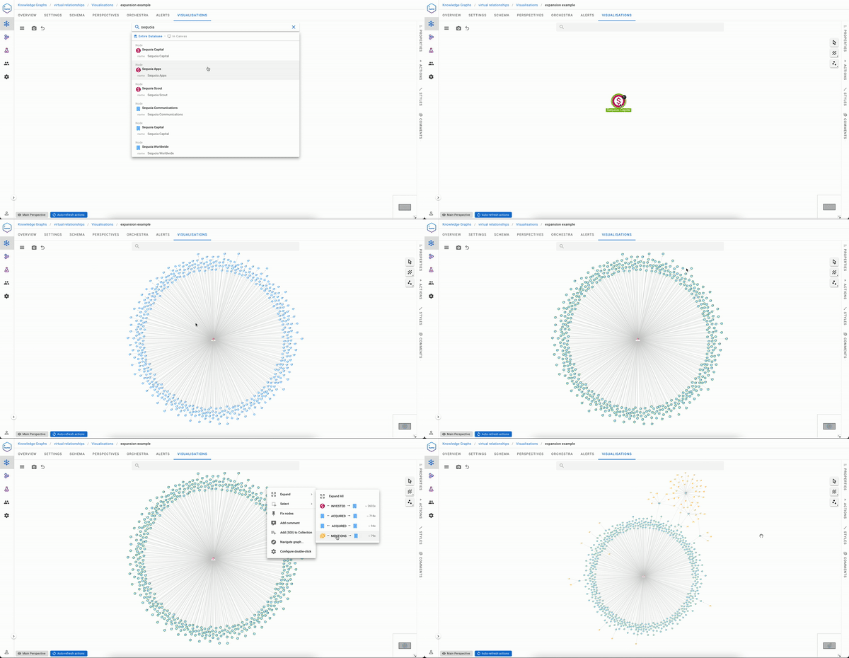
An ideal solution to the exploration experience issue would be to have a direct link between Sequoia capital and the articles mentioning organizations in its portfolio. That said, it would be impractical to materialise this during data ingestion, especially if you need to serve not one but many use cases like the one above.
Virtual Relationships were born to solve this particular problem and have been implemented in Hume since version 2.8.
Creating Virtual Relationships
Nowhere you’ll find a more pleasant way to express virtual relationships than in Hume.
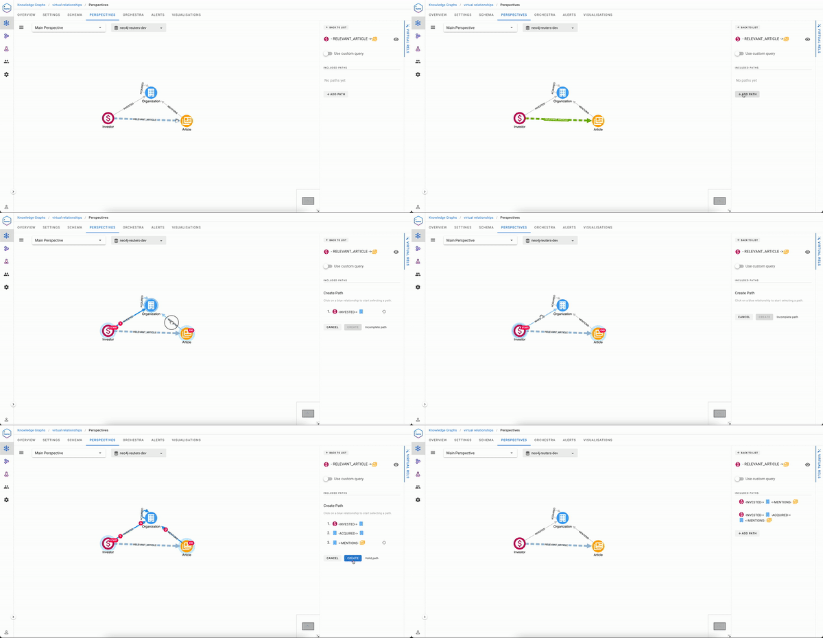
In the Perspectives editor, draw a relationship between two classes and give it a name, for example, RELEVANT_ARTICLE from an Investor and an Article
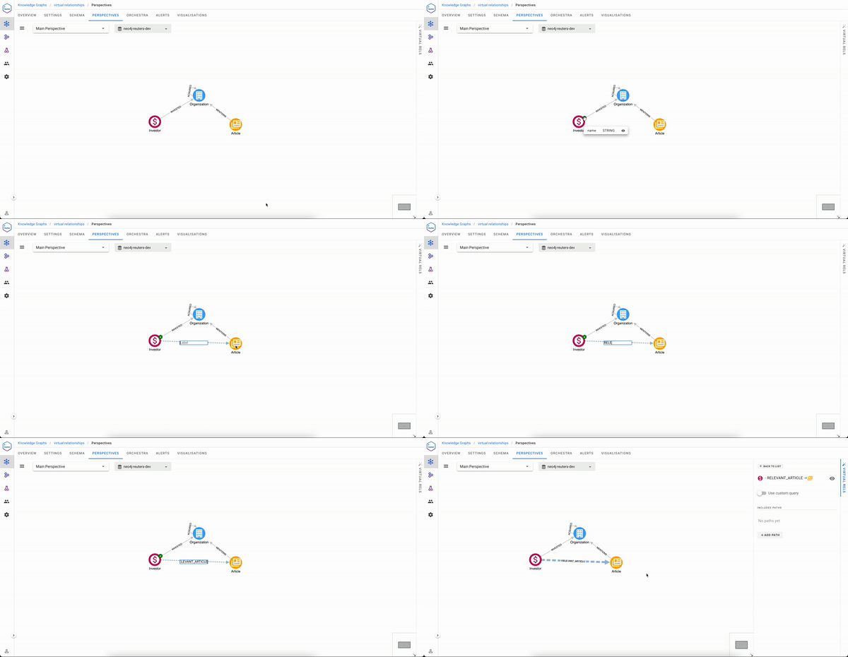
Once done, you just need to select the paths that will express how to traverse in order to build this virtual relationship. We have two possible paths here:
(Investor)-[:INVESTED]->(Organization)<-[:MENTIONS]-(Article)
(Investor)-[:INVESTED]->(Organization)-[:ACQUIRED]->(Organization)<-[:MENTIONS]-(Article)
As you will see, the process cannot be simpler:
Traversing Virtual Relationships
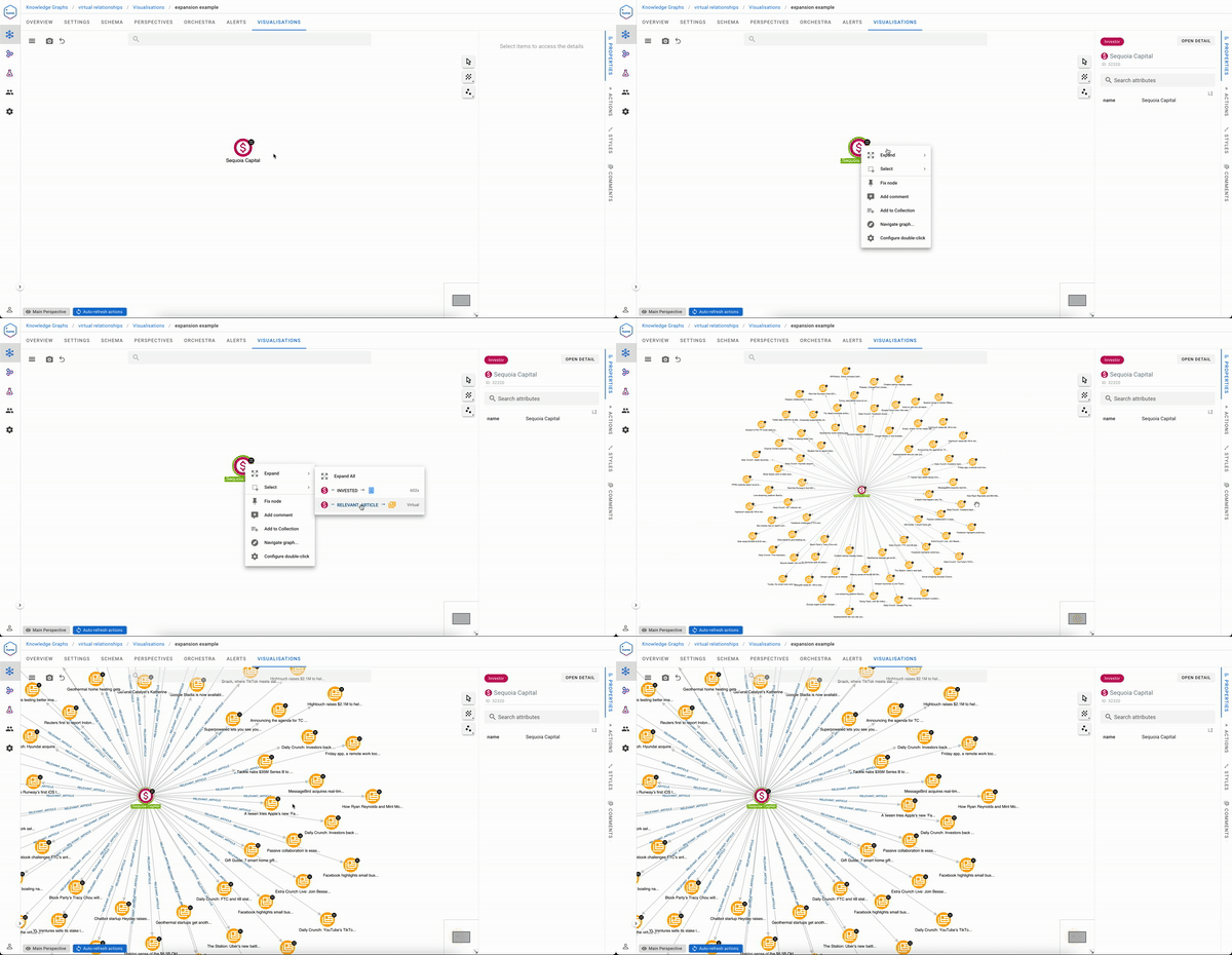
We saw previously that creating virtual relationships in Hume is human friendly but traversing them is even easier.
Now automatically, virtual relationships can be expanded selectively from a right click on an Investor node and will immediately return the right insights to the user.
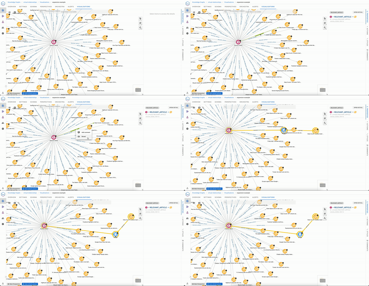
Analysts also have the ability to inspect why a virtual relationship has been created, which can be summarised as “show the concrete relationships that form this virtual one.”
Handling Complex Patterns
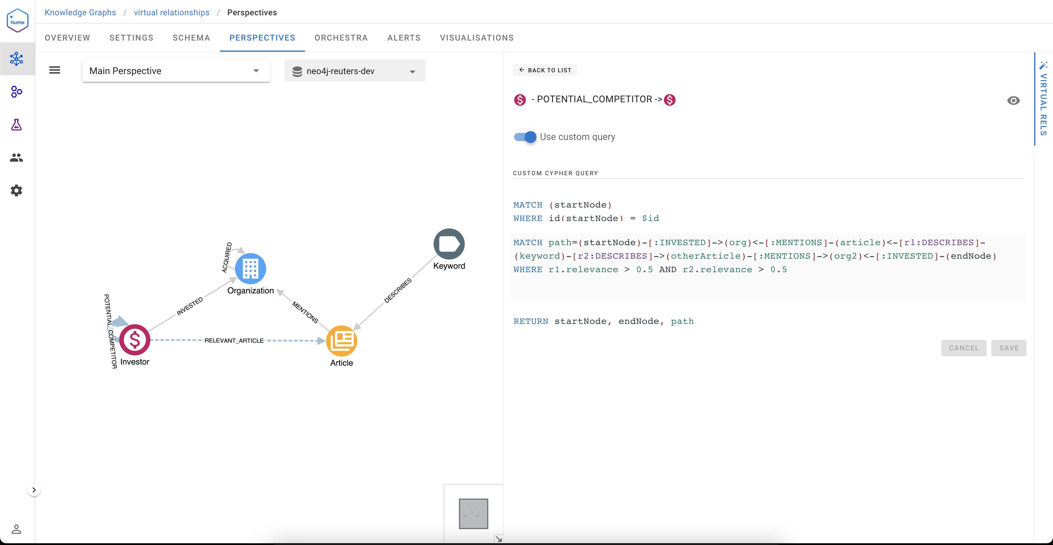
Complex patterns can be expressed by switching from the no-code mode to the Cypher mode for the expression of the pattern. Here we extended the schema with the Keyword class, and we’re finding potential competitors based on the keywords in common in the articles in the paths, keywords having a high relevance (> 0.5)
Might you have guessed?
Suppose you’re already a Hume user and spotted that virtual relationships are described in Perspectives. In that case, you might have guessed - yes, virtual relationships combined with the Perspectives role-based access control allow to offer different virtual views on the same data to other groups of users, and that’s how 360 degrees Insights can be delivered.
What are the challenges in knowledge graph visualization?
Visualizing knowledge graphs involves representing complex networks of nodes and edges in a way that is understandable and useful. This presents several challenges, particularly when dealing with large and diverse datasets. Below is a summary of key challenges in graph visualization, as discussed in a lightning talk by Jan Zak from GraphAware:
-
High Volume of Nodes and Node Types Knowledge graphs often contain a large number of nodes with varying types and levels of importance. This can lead to cluttered visualizations, making it difficult for users to identify key information.
-
Color Management With many node types, using distinct colors to differentiate them can be challenging. Best practices suggest using a limited color palette, generally no more than five to seven distinct colors, to maintain clarity. Exceeding this limit can lead to confusion and make it hard to differentiate between nodes.
-
Filtering and Simplification To avoid overwhelming users, it’s important to filter the graph and present only the most relevant nodes. This requires a careful balance between providing enough information for context and keeping the visualization comprehensible.
-
Technical Limitations Large knowledge graphs can create performance issues, requiring optimization in terms of rendering and user interaction. This can involve using specific techniques or tools to manage large datasets efficiently.
-
Node Positioning and Layout Unlike maps with fixed geolocation, graph layouts must be computed dynamically. This can lead to challenges in arranging nodes in a way that makes sense and prevents overlap or confusion. Additionally, graphs can have “supernodes” that connect to many other nodes, complicating layout and readability.
-
User Interaction Patterns Providing a clear interaction model is crucial. The “information seeking mantra”—overview first, then zoom and filter, followed by details-on-demand—can guide the design of interactive graph visualizations. This allows users to explore the graph at their own pace while avoiding information overload.
Overall, addressing these challenges requires a combination of thoughtful design, user-centric interaction patterns, and the use of specialized tools or algorithms to create effective and intuitive knowledge graph visualizations. You can find more content in our YouTube video below.
How to scale up your D3 graph visualization? WebGL and Canvas
Do you use D3 for data visualisation and either you are considering, or already using it also for graph visualisation? Keep in mind that D3 uses SVG for rendering. While it is the easiest to work with API for drawing 2D graphics on the Web, its downside is that the browser keeps the entire DOM tree of vector elements in memory, even for elements that are effectively invisible. You might hit a performance drop with complex graphics, specifically for graph visualisation when you try drawing graphs larger than ~1000 nodes, or even less with complex SVG effects.
At this time you should reconsider why you run into performance issues in the first place. Why do you have such complex graph to draw, what is the purpose of the visualisation, and how is user going to interact with it? Sometimes too much information can result into meaningless graphics, if user doesn’t know what to do with it.
Since you’re still reading, you probably have reasons? Ok, I warned you :-)
In this article we are going to explore together how you can scale up your existing D3 graph visualisation. Another solution could be resorting to a commercial library, but we are not going to cover it here, because it could mean significant changes to your existing application. However if you are starting a new project, all of these libraries are great to work with and we suggest you evaluate them (listed in alphabetical order): Keylines by Cambridge Intelligence, Ogma by Linkurious or yFiles by yWorks.
Canvas HTML element has a few available drawing APIs, with different performance and browser support. The most advanced, WebGL, uses GPU for hardware-accelerated drawing. However this means that for the best coverage of drawing size, browser and hardware compatibility you would need to implement drawing code multiple times, for each chosen API separately.
Another complexity arises with mouse interaction, because with Canvas you can only detect the mouse position and color at the position. Detecting which element is at the position can be implemented for example by rendering a separate hidden canvas, where color designates the element.
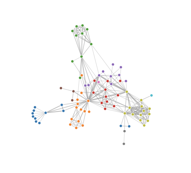
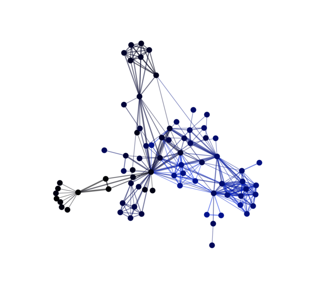
PIXI.js
Enter PIXI.js, a 2D drawing library. It allows you to express a declarative render tree, similarly to SVG. However the render tree is processed in the JavaScript engine only, instead of in the DOM as in SVG. The browser only receives drawing instructions, as if you would write Canvas drawing code yourself.
PIXI.js uses WebGL by default if available, and supports fallback to Canvas otherwise. Mouse interaction complexities are also abstracted away from the developer. No wonder that this library has a heavily active community related to development of browser-based games.
Implementation
We are going to start by forking the original D3 graph visualisation example, which uses d3-force for a force-directed layout.
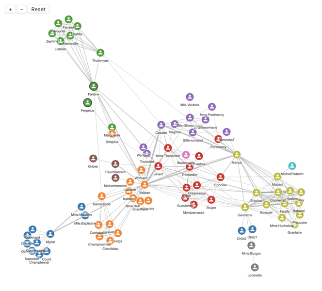
Replacing SVG rendering with PIXI.js involves creating an instance of PIXI.Application and adding children to it, according to the desired style and interaction. Follow API docs for details, their Performance Tips are also helpful. We can add richer features such as labels, font icons, hover effect, zoom & drag viewport and a simple toolbar. Anything is possible!
A live demo of this exercise shows there is almost nothing left from the original code which was related to SVG rendering, it was replaced with code for a different rendering target. PIXI.js rendering runs on top of D3, which stays only for computing graph layout.
How to make the best knowledge graph visualization and 10+ entity states in Graph Visualization?
This is an event where data enthusiasts and experts gather to discuss, share, and inspire new ideas. Hosted across various locations including New York City and Washington DC, these conferences cover a wide range of topics related to data science, graph visualization, and technology. In this session, Dr. Miro Marchi and Michal Trnka from GraphAware discuss the concept of “Entity States” in graph visualization and how to effectively manage them. They provide insights into the principles and tools used to maintain clarity in complex graph data visualizations.
Key Ideas of the meeting:
- What Are Entity States?
Entity States refer to the various conditions or statuses that a graph’s entities (like nodes and links) can exhibit based on user interaction or underlying data.
-
Common Entity States in Graph Visualization
These include selected, highlighted, flagged, hidden, annotated, and others, each affecting how the graph is displayed and interacted with. -
Importance of Managing Entity States Without proper management, overlapping states can create confusion, leading to poor visualization outcomes. A structured approach helps maintain clarity and usability.
-
Principles of Effective Graph Visualization Using context to inform the visualization. Applying flexible and configurable styles for easy development. Ensuring user interactions are intuitive and consistent.
-
Technical Tools and Approaches Using configuration-based styles for easier customization. Leveraging tools like Neo4j and Cypher to manage and query graph data. Demonstrating how styles and states can be dynamically applied to visualize complex relationships.
-
Real-World Examples and Use Cases The presenters share examples from their work with GraphAware Hume, illustrating how graph visualization is applied in real-world projects. The talk concludes with a demo showcasing how various entity states and styles can be used to create a rich and interactive graph visualization experience.
How does graph visualization help intelligence agencies and police?
Graph visualization aids intelligence agencies and police by transforming complex data into accessible visual formats, making it easier to identify patterns, relationships, and key actors within criminal networks. By representing data as nodes and edges, graph visualization allows investigators to quickly grasp how different entities—such as people, locations, and organizations—are interconnected. This visual approach can reveal previously unnoticed links, expose criminal hierarchies, and highlight central figures in a network. For intelligence agencies, graph visualization can be instrumental in tracking terrorist networks, espionage activities, or organized crime rings. The visual representation enables analysts to simulate potential scenarios, predict threats, and assess risks based on observed connections. By visualizing communication patterns or financial transactions, agencies can uncover hidden relationships that might otherwise remain obscured. For police departments, graph visualization is invaluable in cases involving gangs, drug trafficking, or human trafficking. It helps officers understand the structure and scope of criminal operations, allowing them to identify key suspects and plan targeted interventions. The interactive nature of graph visualization also supports real-time analysis, enabling law enforcement to adapt to changing conditions and pursue leads more effectively. Graph visualization empowers intelligence agencies and police by providing a clear, intuitive method for analyzing complex data, facilitating decision-making, and enhancing their ability to combat crime and protect public safety.