Graph visualisation is just what it sounds like – a visual representation of your data as a graph. A graph is a structure of objects that are connected. Thus, graph visualisation is the visualisation of entities (nodes) and relationships among them.
Going back to SQL and to the world of bar and pie charts, we all know the benefits of visualising data. Visualised data is more digestible, understandable, and gets the point across faster. Graph visualisation has these and many more benefits. But before we dive into the benefits and the importance of graph visualisation, let’s take a step back and talk about graphs and graph databases.
Graphs and graph databases
In mathematics (graph theory), a graph is a structure of connected objects. The structure is composed of nodes (entities) and relationships (connections between the entities). Even the picture below is a graph – it shows two entities connected by a relationship. For more details, read my blog about graphs, graph theory, and knowledge graphs.

Graph databases store your data in this structure (instead of, e.g., in rows and columns). Doing so has several advantages (when dealing with connected data), including:
- It is intuitive. Of course, it makes sense to store some data in rows and tables. The data that would make sense to store in this way is not connected. An example would be people and their addresses. Every address would be connected only to the people living there, but not to other addresses.
However, the majority of the data nowadays is complex and connected. Graphs accommodate this complexity with tremendous ease. Their simple and flexible schema can store complex, interconnected information and accurately represent the real world. - It takes up less space. Again, the more connected your data is, the less sense it makes to store it in an SQL database. Doing so would take up more space and would make the data difficult to read, which brings us to the next point.
- Fast and easy access patterns. Every node in a graph can be a starting point for your graph traversal. This translates to shorter time to insight, higher performance, and the ability to provide results in real-time.
- Flexible structures. Even though graphs have a structure, it is highly flexible. It’s only nodes and edges – only entities connected by relationships. Anything in the world can be represented in such a structure. The graph structure mirrors the real world. Everything in the world is naturally connected and complex. Social networks, life stories, and nature are only some of the examples proving the point.
Graph visualisation
Now that you understand the power of graph databases and when to use them, we can get back to graph visualisation. Storing data in a graph and not having it visualised can be enough for some use cases. However, visualising your data almost always helps. Visualisation comes in handy when you need to understand your data quickly. It makes it easy to explain and communicate your insights to others, and it is a means for further analysis.
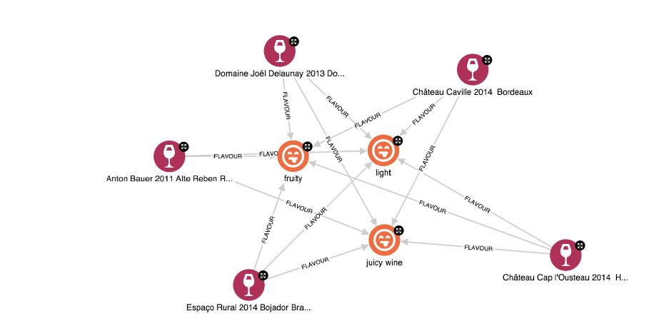
Some (basic) analysis can be performed visually. You can identify patterns, understand connections, and spot outliers directly from the visualisation. Below is an example from our wine graph. You can see that the different wines have the same flavours. This is a very simple example; however, it is clear that the data visualised this way is connected, and the connections are easy to understand.

More sophisticated analysis can be performed with queries and graph data science algorithms. There are many types of algorithms you might find useful to run on your data. And the results of these algorithms are much more digestible when visualised.
For example, you can:
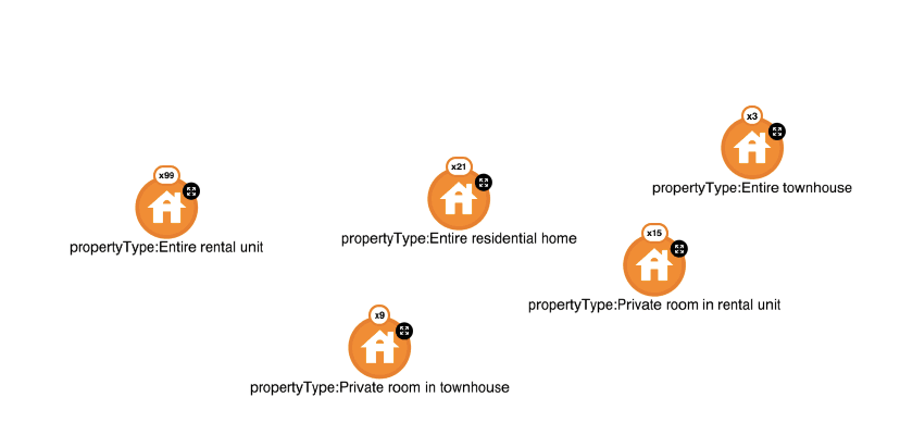
- Visualise identified clusters, their size, contents, and relationships to other clusters. In the picture below, I have grouped housing properties by their type. You can see that in my database, only 3 listings are offering to rent entire townhouses, and many more listings with other property types such as “entire rental units.”

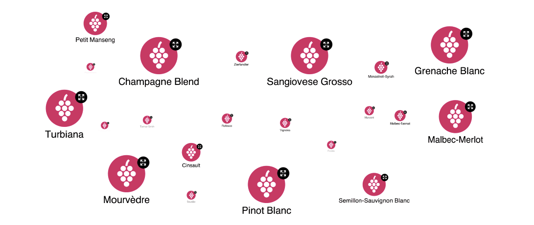
- Visualise the most important (central) entities in your network, sparking further risk analysis. Again, you can see this in the picture below. The size of the nodes is based on their centrality to the entire database. The more wines are connected to a specific grape, the bigger and more central the node is. Thus, you can easily see that there are few Champagne Blend, Turbiana, or Grenache Blanc wines in my database, while many fewer of some other varieties.

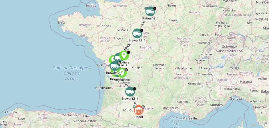
- You can also find shortest paths, e.g. for logistics operations and visualise them on a map.

Finally, interacting with your visualisation allows you to understand the data more easily, explore it, and decide on the next steps for your analysis.
Conclusion
Graph databases are an excellent fit for interconnected data. The benefits of using graph databases can be heightened by visualising the data. Graph visualisations can help you:
- Communicate, explain, and back the results of your analysis.
- Perform graph analysis. Visualising your data allows you to quickly recognise patterns, gaps, and outliers in your data. Algorithmic analysis and its results can also be visualised, making the results easier to understand.
- Interact with the data and gain a deeper understanding of it.
GraphAware Hume allows you to connect, visualise, and explore your data in a single space. Book a live demo and find out how you can benefit from graph data visualisation and analytics.
