
Graph visualisation exists for one reason: connections that are almost impossible to spot in a table are obvious the moment you see them drawn as a network. That’s not a minor convenience. It’s the difference between spending an hour building a mental model of a network versus seeing it immediately.
For anyone working on financial crime, organised crime, or national security cases, that difference isn’t abstract. It’s the gap between a lead you catch in time and one you don’t. That’s what this article gets into: what graph visualisation actually does, and why it earns a bigger role than the “nice to have for the briefing deck” label it usually gets.
In short: a graph is a set of entities connected by relationships. Graph visualisation puts that on screen as an interactive network, with entities shown as nodes and relationships shown as links between them.
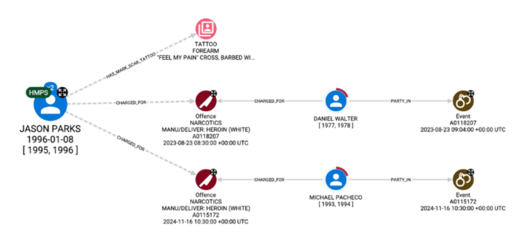
Why connected data needs a different approach
Most investigative data is connected. People link to addresses, addresses link to vehicles, vehicles link to other people, and so on. You can explore those connections in many ways, including tables, spreadsheets, or traditional data analysis applications. But each of those requires the analyst to piece the network together mentally, following one relationship at a time.
Graph visualisation works with the way the human visual system naturally processes information. Compare the same data presented as a spreadsheet and as a graph.
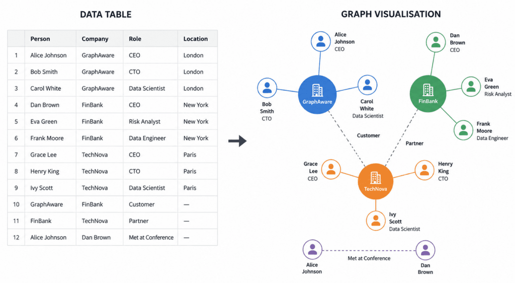
In a table, analysts must compare rows, follow identifiers, and mentally reconstruct the relationships. When the same data is presented as a graph visualisation, those relationships are immediately visible as a network.
Our brains are remarkably good at spotting visual patterns, clusters, and outliers through pre-attentive visual processing. Instead of spending time assembling the picture, analysts can spend their effort interpreting what it means, following new leads, and identifying the connections that matter.
Graph visualisation vs graph-powered intelligence analysis
There’s an important distinction to make: graph visualisation is a core technique used in graph-powered intelligence analysis, but it isn’t the discipline itself.
Intelligence analysis spans the entire lifecycle of an investigation, from data collection and processing, through to analysis and dissemination.
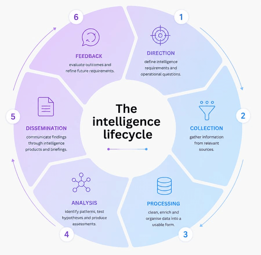
Graph visualisation plays an important role in the analysis stage, alongside other techniques like temporal analysis, geospatial analysis, centrality analysis, filtering, and query building. Together, these capabilities turn raw, multi-source data into intelligence that can be understood, shared, and acted on.
What changes when you can see the graph
A few things become possible once a network is on screen, instead of buried in a table.
Hidden groups become visible. A set of accounts or people who share just enough in common – an address, a device, a shared contact – will visibly cluster together, long before an analyst relying on tables and manual search would have thought to group them.
Then the entities holding that cluster together stand out. With the right graph layout applied, the most connected and important nodes tend to be visually obvious. For an analyst working through a caseload, that’s a fast way to see where to look first, without reading every single record.
Once you can see the central players, the routes between them follow. Money laundering routes, supply chains, communication trails: these are all about the path from one point to another, and a graph shows you that path directly, rather than making you piece it together.
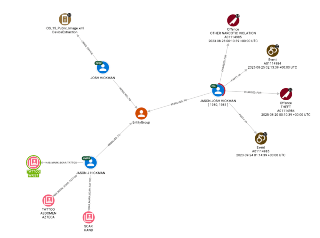
None of this replaces judgement. What it does is close the gap between having the data and being able to reason about it, so time goes into deciding what matters, not into rebuilding a picture that already exists in the data.
What happens when the network gets big
There’s an obvious objection to all of this: real investigations don’t involve forty entities; they involve thousands, or millions. Presenting that many nodes on a screen as a static image is pointless; nobody can read it, no matter how the data is stored. But there are real strategies for making large-scale graph visualisation useful.
Start small and expand out. In GraphAware Hume, Advanced Expand lets an analyst pick a starting entity, then build outward hops at a time, rather than loading the whole network at once.
Apply filters to focus on what matters. Narrowing the view to specific entity types, relationship types, or time ranges keeps the screen showing only what’s relevant to the question being asked.
Run layouts to bring structure back. Layout algorithms can tidy a dense graph and identify structures that stay hidden in a hairball graph.
Use centrality to prioritise. Centrality analysis highlights the entities that matter more than others in a network, giving an analyst a place to start when a case has too many entities to review one by one.
The scale of your data shouldn’t be a blocker, as long as your chosen visualisation solutions give the analyst a way to control what’s actually on screen.
See the network, not just the record
The biggest shift here is what you’re actually looking at. A table shows you one record at a time. A graph shows you a network, and a network is usually what an investigation is really about, not whether one entity looks suspicious on its own, but how it connects to everything around it.
That takes a different way of working, and a different kind of tool to support it.
GraphAware Hume turns connected data into a network you can see, explore, and filter, not just query. Book a demo to see it in action.